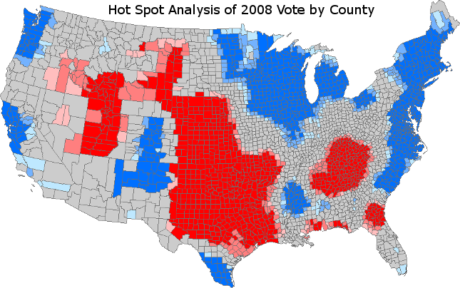
Here in the United States, merely to mention “red states and blue states” is to activate a strong Pavlovian response. We’ve all been classically conditioned to think politically – to see red as “Republican” and “blue” as Democratic. And regardless of our political persuasion, the term triggers a frisson, a shiver, an adrenalin rush. Here’s an example, taken at the county-level for the 2008 presidential elections:
But red and blue “Arndt” used solely to denote political leanings. As in Deke Arndt, chief of the Climate Monitoring Branch at NOAA’s Centers for Environmental Information. To the benefit of the country and the larger world, Mr. Arndt and his colleagues at the NOAA National Climatic Data Center spend their days and nights teasing high-value environmental intelligence out of seemingly drear climate data – the stupefyingly large amounts of temperature, humidity, wind, and other readings gathered moment by moment, year after year, century after century, around the globe.
But that isn’t all they do. They also think up elegant ways to convey that intelligence to decision makers and to you and me.
Here’s a recent example, just one of many, reported by Jason Samenow and the Capitol Weather Gang, who are no less gifted in bringing environmental intelligence to life.
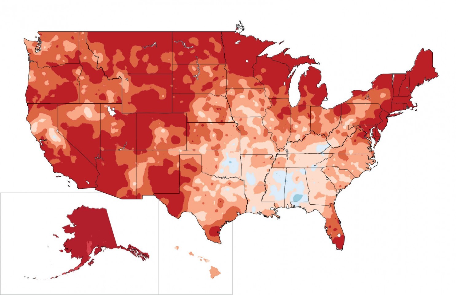
The map goes back a ways. From the 2014 National Climate Assessment, it shows climate warming in U.S. from 1991-2012 compared to 1901-1960 average. Red represents temperature increases; blue denotes decreases.
Mr. Samenow’s piece also presents a table compiled by Mr. Arndt and the folks at NCEI, and recently updated:
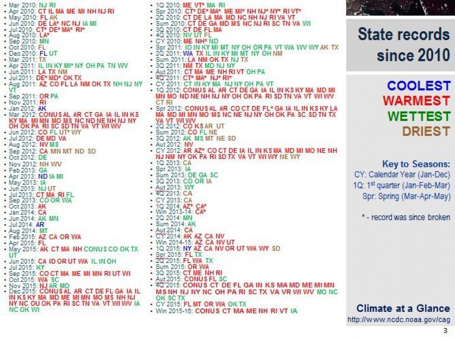
Some verbatim excerpts from Mr. Samenow’s commentary:
…U.S. states are setting new records for extreme warmth with regularity while record cold is almost impossible to come by…
…Arndt’s slide shows all state records set for warmth, cold and precipitation extremes since 2010…
…States have set monthly records for warmth 132 times in the past six years, as portrayed by all of the red in the left-hand column.
Blue, which represents record cold, is conspicuously absent. In 3,500 opportunities (considering that there are 50 states and that 70 months have passed), states have logged a record cold month only four times…
There are some big differences between the temperature map and the political one. For starters, there’s nothing personal about the temperature data. They simply are what they are — a reflection of physical realities. By contrast, political maps such as the one shown hint at what we think — you and I and the people who live near us.
Second, the political map is far more balanced. In the United States, presidential nominees more-or-less historically have enjoyed roughly one-chance in-two of being elected leader of the free world (versus the one-in-three-hundred-million odds facing you and me). It really doesn’t matter much who’s running, or what is going on. The electoral-college system in the United States has the effect of magnifying small differences in the popular political support, and also reducing the need for and extent of recounts, but the election results are never as lopsided as those temperature trends shown here. One chance in two. By contrast, your chances of being in a cooling county are pretty much no-existent.
But there are also similarities. For one, like politics, all climate is local. Similarly, for whatever reason, climate science, even mere climate data, seem to trigger a corresponding Pavlovian response – that same adrenalin rush – in many of us that politics evoke. Finally, as big data and data analytics continue to take hold, the value of both the political and the environmental intelligence the maps reveal will each increase.
The maps, and their narratives, are not going away. They’ll figure every more prominently in our future. And, as their messages grow compelling, and as our skill in social science and data analytics continues to advance, the messages will start to thread together.
That reality might suggest that the cooling we need most – the cooling that could in turn foster actions and dialog that over time might lead to a cooling of political and atmospheric temperatures – is emotional.
Enjoy a calm spring day. Allow it to change you.

Bill:-
I find the temperature plot and the implied interpretation disturbing, and going against what you rightfully preach in your post.
1. Why in the name of all that’s holy did they pick 1901-60 as their baseline? An awful lot of volatility there (low to high temperature in the range of about 0.4 deg C – and an overall increasing temperature trend) making an average less meaningful than other possible selections (e.g., 1945-75 with a H-L ~ 0.1 deg C and no trend).
2. I’m not really impressed with local record temps unless they’re compared to the std dev’n around the average. If they are more than two std dev’ns, that becomes much more meaningful.
3. And isn’t this warming a good thing? After all, ~8X more people globally die of extreme cold than die of extreme heat. Might it not be that the optimum temperature is where the two death rates are the same?
I’m not denying global warming – clearly it has occurred over the last 100 years. I am simply saying a) record temps tell me nothing about rate (Remember all those people saying “2014 was the hottest year on record,” but who failed to add “by 0.14 degree”); b) aren’t we being a little hasty in deciding whether that warming is good or bad – esp. given the accelerated rate of ag productivity this century? In other words, I accept the data, but the interpretations – and the implied value judgements – need a lot more work. And let it be done on the terms you set – without emotion. However, let me also ask that the work be done without any attempts to deny free speech to anyone, no matter what their opinion about global warming. The only way we can get the science right is by continual probing even by those who are wrong: to paraphrase Nietzsche, the “errors” of great men are often more fruitful than the “truths” of others.
🙂 Thanks, John, very thoughtful and insightful as always. A lot more incisive and profound than my original thoughts.
Not sure about the preaching… hoping mainly to leave that to others, but maybe we all, myself included, sound a bit more preachy to others than we do to ourselves. If so, I regret that. Just happened to be struck by (1) the superficial similarity in these data displays we build from what we tend to think of as disparate worlds, and (2) the way they seem to conjure up similar emotional responses.